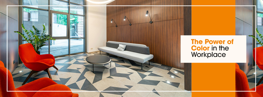
The Power of Color in the Workplace
Color – it’s all around us, but we rarely consider how it might affect us. Yet the impact of color on our emotions, reactions, and modes of thinking is undeniable. Color has the power to excite or soothe, raise or lower blood pressure, and even affect our appetite. Some colors can spark positivity or motivation, others can create a sense of peace and concentration. Color has such an impact on us, there is a whole section of psychology dedicated to its study.
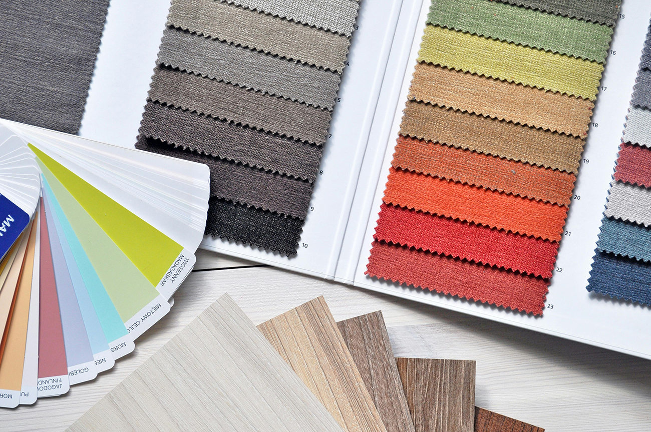
Because color can so strongly impact the workspace (as well as those who occupy it), it needs to be used effectively. If you want to foster an environment that inspires creativity, productivity, and engagement, as well as the comfort and satisfaction of employees, you should be mindful of the color palette you choose in your decor.
Think about this: You’re an architectural design firm specializing in modern design. Would you use dark, heavy colors like overstuffed chocolate brown couches and velvet, merlot-colored drapes that inspire the feeling of a Victorian drawing room? Or would you choose sleek black furniture with clean lines and a pop of bright aqua or sunburst orange here and there to stand out against stark white walls? The former feels stuffy and old, quite the opposite of modern. The latter feels fresh, sophisticated and edgy – exactly what an architecture firm specializing in modern design would want to inspire.
Among other products and services offered, CMF provides design services to help ensure you make choices that create the perfect environment to reflect and address your specific needs and goals. These include assisting in selection of materials, colors, light fixtures, artwork, floor and wall coverings, furniture, cabinetry, storage, and more.
Overall Positive Impact of Colors
The color scheme of a workplace can have significant specific impacts on employees in multiple ways. Some of those include:
- Enhancing productivity by improving focus and positivity
- Mitigating and/or preventing burnout or boredom, which then leads to sustained motivation and engagement
- Calming overwhelm and helping employees remain relaxed even with in the face of looming deadlines and critical decision making
So, what color should you use and why? And, in contrast, which ones should you avoid?
Here are the nine most common colors in the workplace and how they affect us.
Red
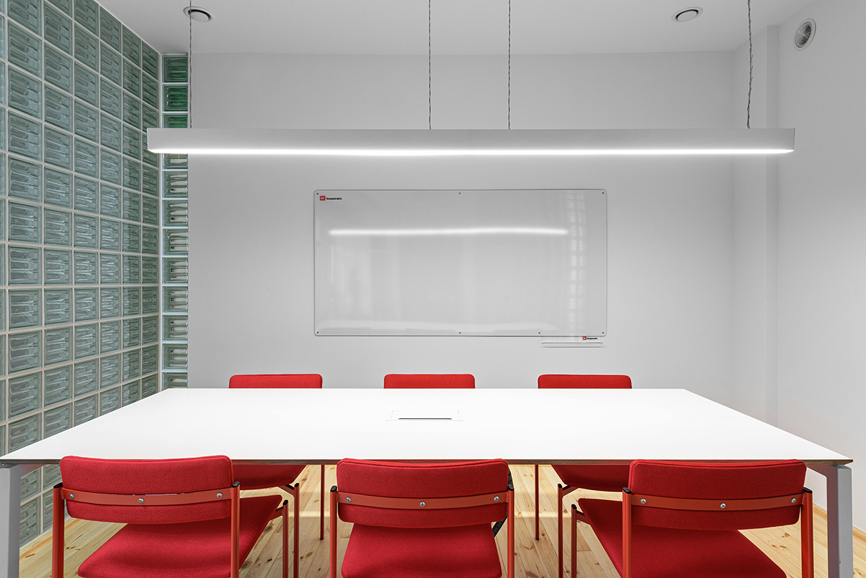
Red is an intense attention-grabbing color associated with a wide range of physical and emotional reactions, from love to anger to strength to danger. It’s been shown to raise blood pressure, boost metabolism, and increase heart rate. It is especially useful in spaces where you want pump up adrenaline, but while it does have excellent energy-boosting qualities, it can also overwhelm people and make them feel anxious. As a result, red should typically be used carefully, selectively, and in small doses.
Blue
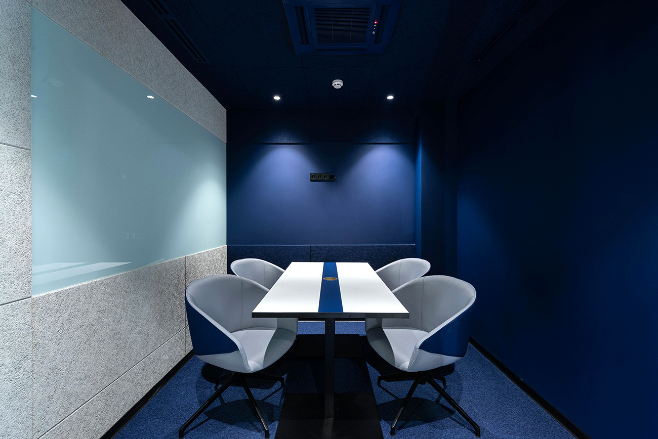
Blue has a calming effect that helps reduce stress. The color invokes trust, tranquility, stability, intelligence, and confidence and is often used in places where trust is a priority, such as law offices and counseling rooms. That said, take care in what blue hue you choose, because dark blues can invoke sadness. Also, blues can reduce appetite, so restaurants would do well to steer clear of it.
That said, blues that register at around the 17,000k color temperature can actually activate and energize. This is because, according to an article by Forbes about how color psychology impacts today’s workplace, blues in this temperature “suppress the body’s natural production of melatonin” thereby making us LESS sleepy and calm.
Yellow

When we think of yellow, we often think of sunshine and happiness, warmth and joy. And while this is true of certain light yellows, darker yellows can, unfortunately, have the opposite effect, invoking sickness and decay instead.
Overall, yellow stimulates mental activity and is often associated with increased creativity and spontaneity. It works best in environments geared towards creative pursuits, such as ad agencies, design studios, and visual arts centers.
Green
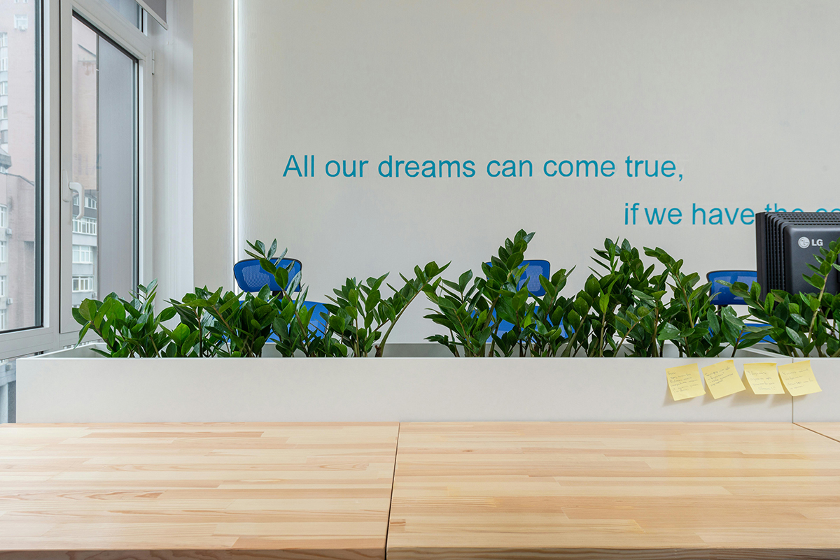
Not surprisingly, given its association with the advent of spring, green invokes feelings of growth, wisdom, renewal and harmony. Like blue, it also has a calming effect and comes in handy in high-stress environments, especially those with long working hours. It improves vision and helps to alleviate depression.
Green is a great color for places known to cause visitors stress, such as dental offices. It is also ideal for places that benefit from feelings of calm, such as psychiatric clinics, schools, and therapy centers.
Orange
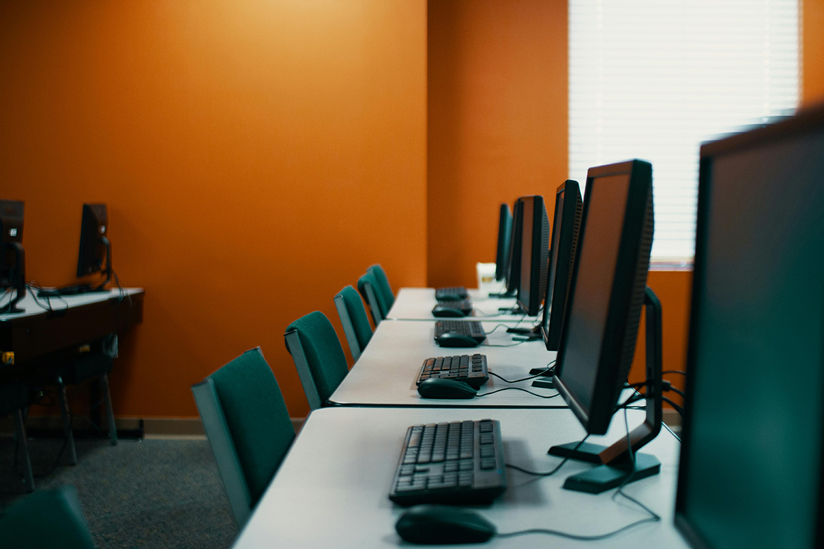
While orange is bright like red, it lacks red’s association with aggression. Instead, orange has been shown to promote encouragement, excitement, and enthusiasm. It enhances communications and socialization, has an expansive and inviting feel, and is particularly good for boosting self-esteem and inspiration. It even helps stimulate brain activity and increases oxygen flow.
However, as with the other colors, which hue you choose will have significant impact on how it affects people. While peachy oranges invoke friendliness and golden oranges invoke wisdom, dark oranges invoke distrust.
Orange is an excellent choice for consulting firms and IT companies. With its inviting vibe, it’s also good for welcome centers.
Purple
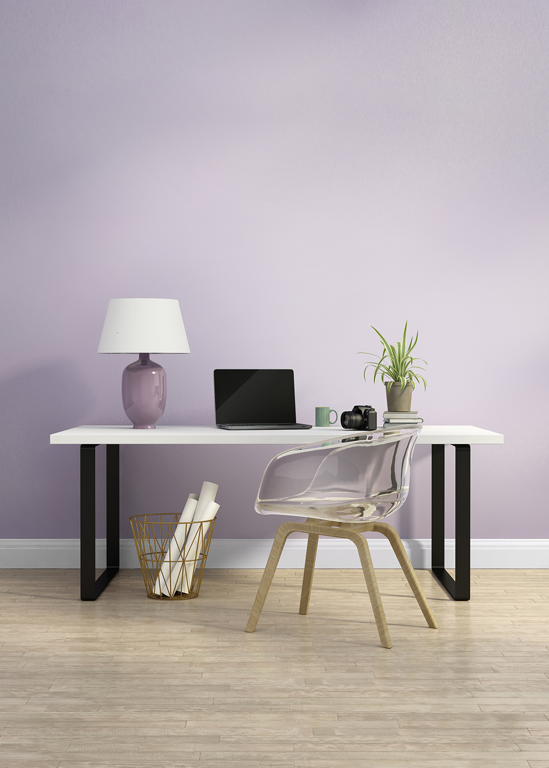
Purple combines the stability of blue with the energy of red, resulting in feelings of relaxation as well as power. It also inspires creativity and curiosity, making it a good color for sparking new ideas. Its association with comfort means it encourages nurturing tendencies, making it a good color for workplaces that work with elderly people and babies.
Purple also invokes feelings of magic and mystery and is associated with dignity, nobility, extravagance, and luxury. Lighter purples tend to feel romantic and dreamy, while bolder purples promote feelings of nobility and wealth. Dark purples can invoke feelings of sadness and frustration, though. Choose your purple wisely. Also consider using it sparingly and in the appropriate setting, as it can promote feelings of sleepiness.
White
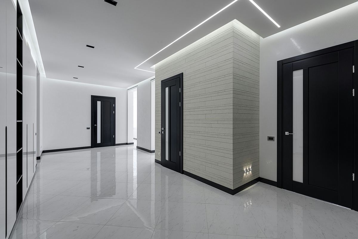
White indicates wholeness, simplicity, purity, and goodness. It is believed to cleanse negative emotions and encourage renewal. It is also associated with cleanliness and efficiency, which is why it is often used in hospitals and labs and any place where hygiene and sanitation are important.
In addition, white symbolizes hope, fresh starts and blank slates and is believed to encourage creativity. Because it is bright, however, too much of it can be headache inducing. So, if you choose to have a lot of white in your space, make sure there is plenty of other color to soften it and break it up.
Black
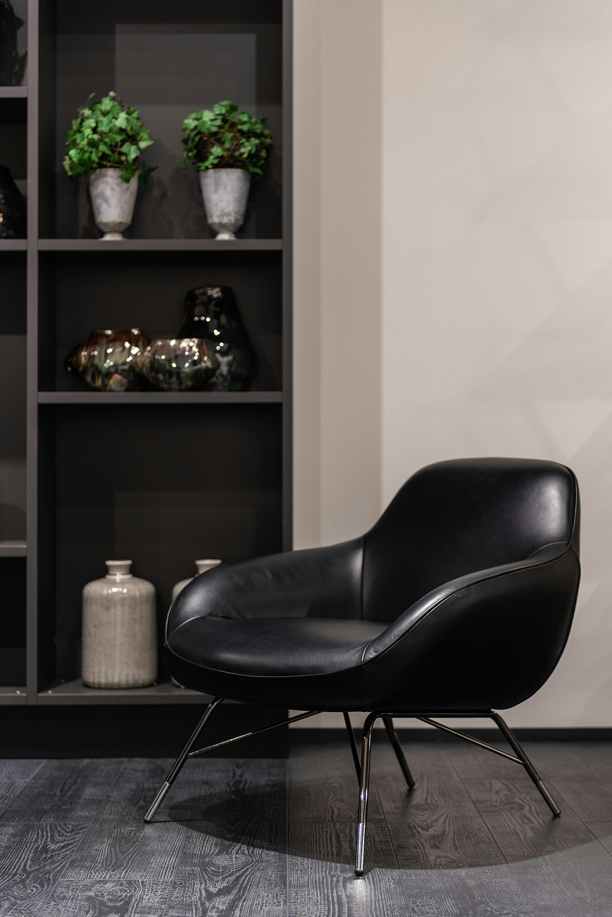
Black is a challenging color because it represents such a wide range of emotions and sentiments. It symbolizes power, elegance, authority, professionalism, and formality. Unfortunately, it also symbolizes death, grief, evil, and the unknown. While it can add a dramatic and sophisticated flair, it can also overwhelm and produce feelings of sadness, not to mention it can make a space feel smaller and more cramped, creating a sense of claustrophobia. As a result, black tends to be better as an accent color in a workspace rather than a dominant one.
It’s a great color for any space where you want to inspire feelings of accomplishment, elegance, professionalism, and power. It is also good for promoting efficiency and discipline.
Brown
Brown can be very challenging because certain shades, such as beige, can invoke a sense of boredom and disgust. While deeper chocolate browns tend to feel warm, comforting, dependable, down-to-earth, and resilient, due to their association with clubhouses and libraries, they can also inspire a sense of elitism, uptightness, and rigidity. Brown does not promote a feeling of youthfulness or curiosity, so while it’s a good color for any space you want to feel ‘cozy,’ it is not a good color for any space where you’d like to spark fresh ideas. Or motivate people.
Beige is also a challenging shade because it has been so overused and is uninspiring and dull. It walks a very thin tightrope between calm and gloomy. While it is a basic color that is often used because it is nondescript and neutral, it is, in fact, that neutrality that can render it problematic, especially in spaces where you want to inspire energy, productivity, and creativity. If beige is your predominant color, make sure to bring in bright accent colors to liven it up.
Layout and Color
Keep in mind that your overall space layout will factor into which colors you choose. How you use that space and the size of it will heavily influence how you decorate it. For example, you wouldn’t have bright red walls in a spa waiting room. It would inspire the opposite of relaxation. But using it for a gym would give the space lots of energy, which is exactly what you want a gym to inspire. An ad agency with a layout that consists of many small cubicles and offices would benefit from colors that lighten and inspire creativity rather than ones that darken and feel heavy and depressing.
In addition to our design services, CMF offers CAD and space planning services that can help ensure your space is used in the best way to foster the results you need.
Your color choices and where you use them can make your workplace the kind of space people not only work well in, but also enjoy coming to. Or they can make it a space that they dread and want to avoid. They are also a useful marketing tool for your brand. Be smart and strategic about what you choose.